cornell transfer connect.
My team and I designed an app to help transfer students at Cornell navigate academic and social opportunities by providing personalized resources. By fostering meaningful connections and a sense of belonging, the app enhances their overall college experience and supports a smoother transition.
Tools: Figma, UX Research, Adobe Photoshop
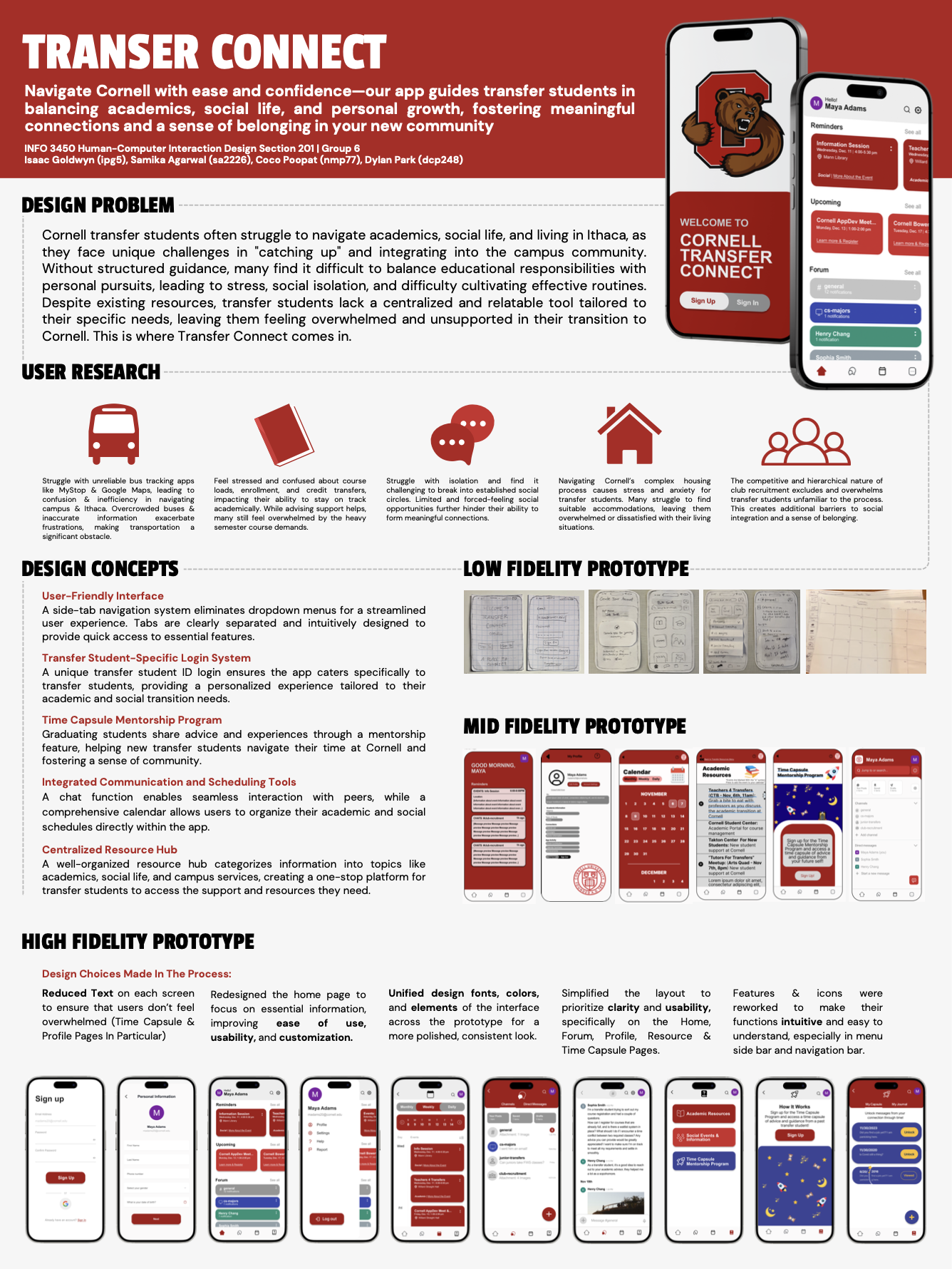
the problem.
Transfer students at Cornell often struggle to balance academics, social life, and adjusting to life in Ithaca, leading to feelings of overwhelm and isolation. Unlike traditional students, they enter an unfamiliar environment mid-college, requiring guidance on navigating coursework, extracurriculars, and daily life. This app aims to help transfer students build effective routines, fostering academic success, social connections, and overall well-being.
interviews.
Together, we developed an interview protocol, problem statement, and persona. We conducted 10–15 interviews with Cornell transfer students to gain deeper insights into their painpoints, needs, expectations, and emotions. After organizing, analyzing, and interpreting our data using an affinity diagram, we identified six key insights: academic issues, social integration struggles, housing difficulties, club recruitment stress, reliance on tech, and transportation challenges.

brainstorming & sketching.
In the next stage, we refined our problem statement based on insights from the interviews. We then explored the existing solution space, including Cornell resources, websites, apps, portals, and advisor meetings. After evaluating the strengths and limitations of these solutions, we sketched ideas and storyboards and brainstormed the most effective ones. One of my favorite features of the app is the Time Capsule mentorship program we developed.


paper prototype & user testing.
In this stage, we refined our designs, ideas, and UI/UX principles to best communicate our goal and address our problem statement. Each team member created a working paper prototype using materials like paper, glue, cellophane, and stickers to represent key features of our digital design. Through Think Alouds, we then tested all four prototypes, recording observations and taking notes on how they navigated the prototype and what feedback they provided. These insights guided our initial Figma prototype, helping us refine the design for better functionality and user engagement.
Here are videos on how to use one of our prototypes: https://vimeo.com/1028212992 & https://www.youtube.com/watch?v=UQGLhC2YP4s

initial figma prototype & user testing.
We implemented our suggestions and edits from Stage 4 into our initial Figma prototype. Our goal for the app is a streamlined and visually cohesive design, prioritizing clarity, ease of navigation, and Cornell University’s branding. Key pages, like the Forum and Time Capsule pages, have a lot of content, so we need to incorporate a clean layout, intuitive interactions, and accessible features. From the usability tests and heuristic evaluations, the main feedback was that there was cramped text and inconsistent icons, hindering usability and seamless experience.

final design.
In the 6th and final stage, we went through multiple cycles of iterations and testing to ensure our design meets our users’ needs. Our most impactful improvements were the Transfer Resources Pages, Home Page, and Time Capsule Pages in terms of reducing clutter, ensuring consistency, including personalization, improving readability, and ensuring that key interactive components are prominent.


final poster presentation.